Let’s start at the beginning: making responsive webcomics wasn’t my first choice.
A few years ago, I started thinking about uploading some comics to the web. It seems like a simple and easy-to-implement idea, but as always happens to me, it wasn’t.
My first option was to upload them as PDFs and that’s it—let people download them or read them online. But they didn’t read well on cell phones. And that wasn’t an irrelevant fact: over 50% of the people who read this site come from a mobile device. I assumed it was the same on other sites, so a comfortable reading experience on cell phones was a priority.
My first idea was to follow the Webtoon model, which is perfect for cell phones. After a few tests, it didn’t convince me; it was too far from what a comic is for me. You can see an example of those failed tests here.
Time passed, I got over my analysis paralysis, and I arrived at another idea: Responsive Webcomic.
What is responsive design?
When we use the term “responsive,” we mainly mean “responsive design.” This means making a website accessible and adaptable on all devices: tablets, smartphones, etc.
I thought if this worked for websites, it had to work for webcomics. But there was a small problem: I know nothing about web programming.
The solution came with CSS Grid, a tool used for web layout, mainly for image galleries. That solved my problems. I could create responsive webcomics with CSS Grid and use jQuery to modify the layout for cell phones. I know all this seems complex if you don’t know anything about web design, but you’ll understand soon.
Join me in this super long article about web programming without having a clue what it’s about, because I’m an artist, not a programmer.
Thinking for Mobile
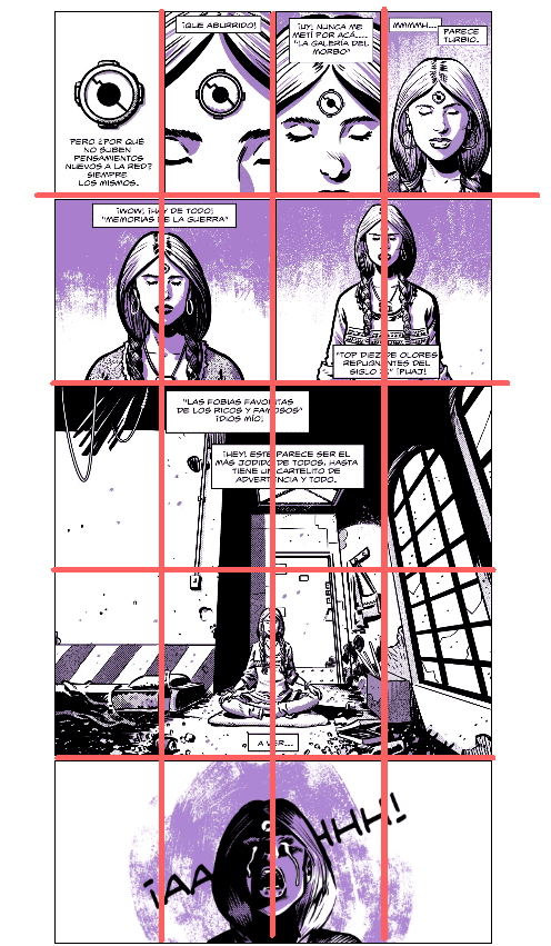
On the left, you can see the comic as it looks on a PC; on the right, the version of the same comic for a smartphone.
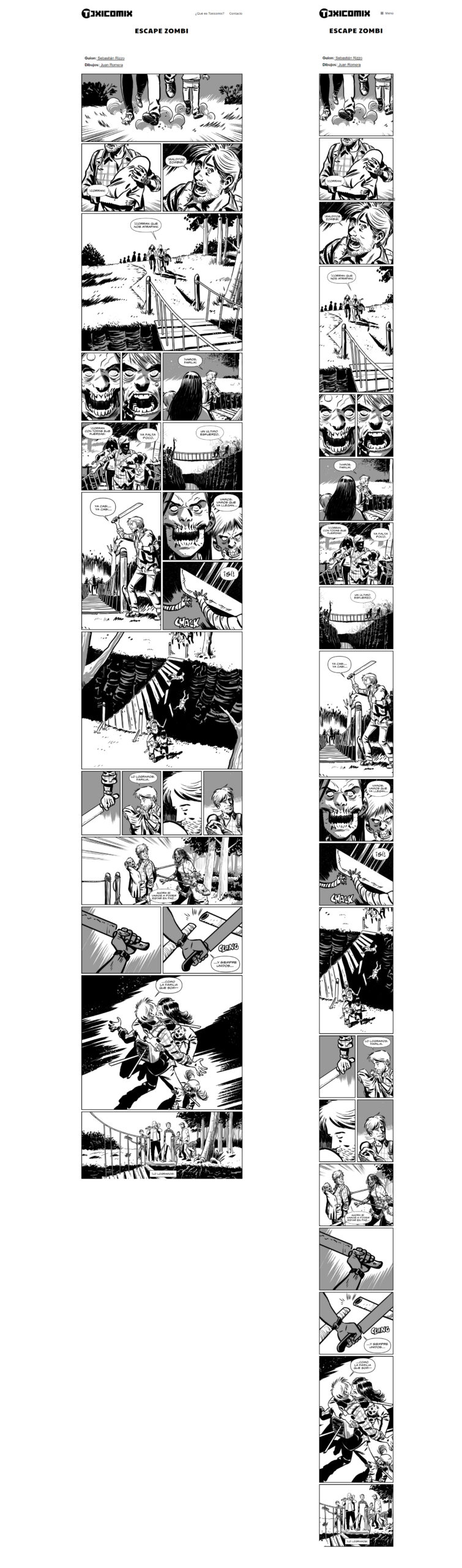
As you can see at a glance, the panels rearrange for reading on cell phones. That’s the magic of CSS Grid and jQuery.
As a warning before we start with the code, each panel must be an individual file. And in this first example, all panels are the same size.
HTML
CSS
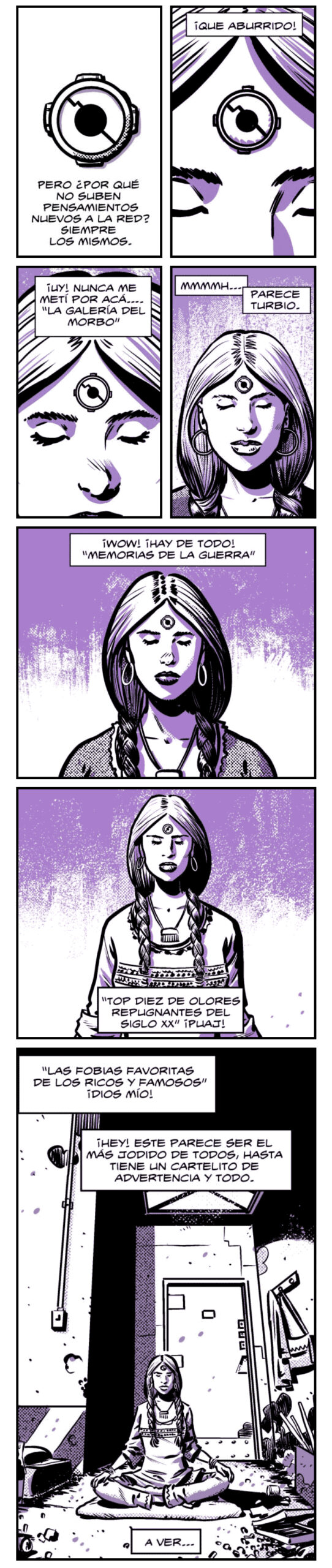
This is the webcomic where I used that code.
In this example, all the panels are the same size, so the CSS code is much simpler. For the PC version, we have 2 adjacent panels, and in the mobile version, one panel below the other.
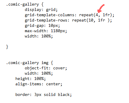
I won’t go into details of every element in the CSS, but I will on the most important ones for making a webcomic. This is the part of the CSS that affects how it will look on a computer:
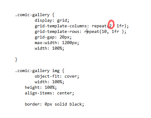
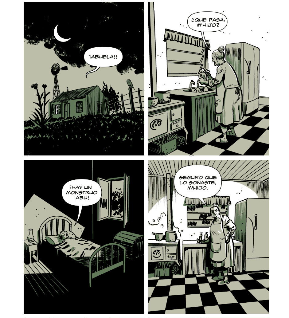
That “2” means the number of columns that will be side by side. In this case, each column will be a panel and it will look like this:
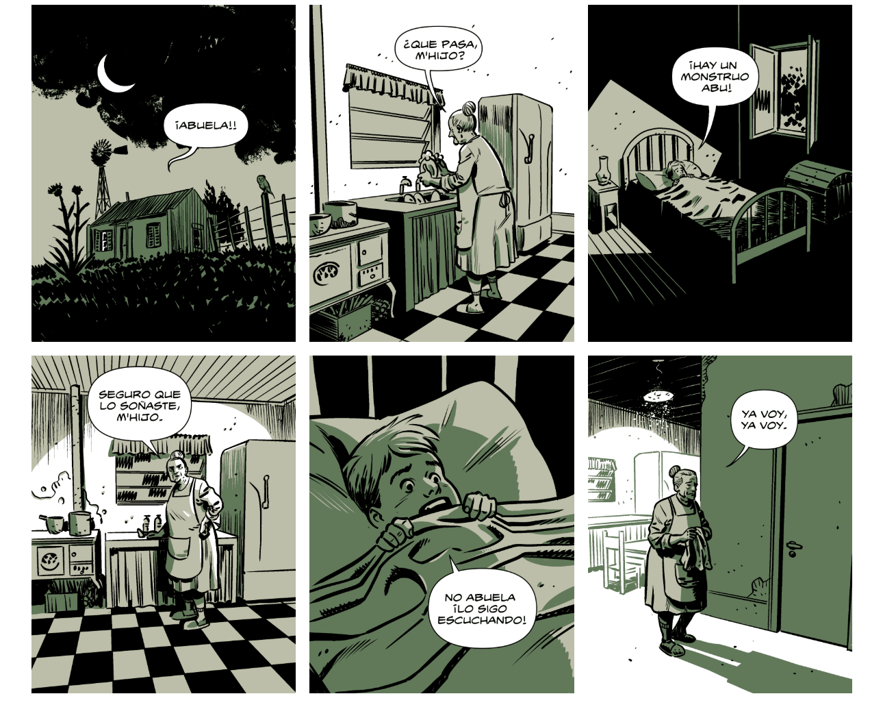
But if we change the 2 to a 3, it will look like this:
So, depending on the number of adjacent panels we want, we can change the value of REPEAT.
In the CSS we can also see these values:
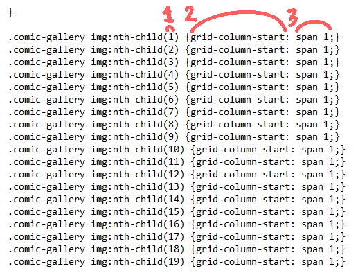
1: This is the number of the image we use in the HTML. It’s not the name of the file, but the order it’s in. In this HTML example, the first image is called “01.png”, but if it were called “sorucho.png” it would work exactly the same.
2: grid-column-start: Indicates in which column the grid item will start.
3: span: Indicates how many columns that image will occupy—in this case, one.
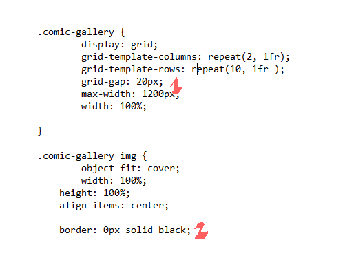
1: grid-gap: This is the separation in pixels between the columns and rows—essentially, the size of the gutters separating our panels. It can be bigger or smaller, depending on your taste.
2: border: 0px solid black:This is the border our panels will have. In this case, it’s “0” because they have no border. But, for example, this webcomic has a 3PX border. The important thing is that the panels themselves have NO border in the drawing file. Example:
This is the jQuery part, and it affects how it will look on cell phones:
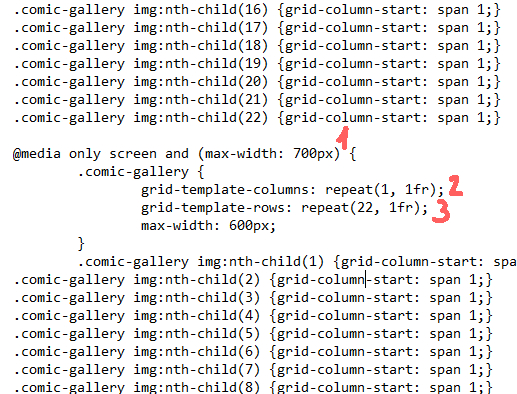
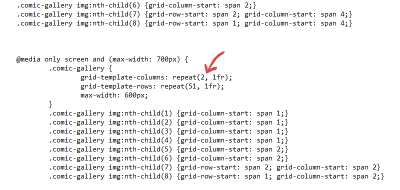
1: This is the screen size in pixels at which it will “break” the desktop view and rearrange for mobile reading.
2: The number of columns – in this case, just one.
2: The number of rows. And careful here! For mobile, it’s important to put the number of rows formed based on our total number of panels.
For the images, we follow the same logic we saw earlier.
And with that, we can already make our responsive webcomic, easy and simple. But if you want to use a more complex page layout, keep reading.
More Complex Comic Page Layouts
We’ve already seen that each column and row can represent a panel, but can the comic page layout be made more complex? The answer is, obviously, YES.
For this example, we’re going to use the following responsive webcomic.
Instead of using “grid-template-columns: repeat(2, 1fr)” Usamos 4 “grid-template-columns: repeat(4, 1fr)“
Something we have to keep in mind when using rows and columns is that they are combinable. So, we can create something like this (desktop view):
The CSS code for these panels is as follows:
CSS
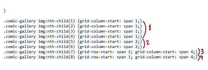
Panels 1 to 4 occupy 1 column each.
Panels 5 and 6 occupy 2 columns each.
Panel 7 occupies 4 columns and 2 rows. The number of rows is called from this code: grid-row-start: span
Panel 8 occupies 4 columns.
The code for cell phones is similar to the example we saw before, but instead of 1 column, we use 2.
As you can imagine, this way of making webcomics is like putting together a puzzle, and sometimes it’s very limiting. But so far, it’s the best way I’ve found, or at least, the one I like the most.
Disclamer
Like I said right at the start of all this chatter, I’m not a programmer. Therefore, I might have made mistakes while writing this and I’ve probably used non-technical vocabulary. My apologies to the programmers.
It’s likely that the code I use isn’t perfect, or maybe there’s an even simpler way to do the same thing.
Leave your doubts or questions in the comments and they will be answered within my limited knowledge.
Finally, I don’t want to forget to mention some other webcomics that are also responsive.
Mask
A walk in the city
Alas de madera / La Bandera
Developer comics
Stephen Collins
I’m surely missing many, but these are the ones I found along the way.
See you next time