One of the most common mistakes we make is creating a page with a poor layout, where the panels are poorly arranged and hard to read. I think this has happened to all of us at least once, and it’s even common to see it in professional comics.
Like writing, comics have a reading order: from left to right and from top to bottom (I know, it’s obvious :P). But even though it seems simple, we often design pages that confuse the reader and make reading a chore.
A good reading flow will help guide the reader’s eye across the page; it’ll be like taking them by the hand through each panel. If we make poor use of page layout, the comic will still be readable—the reader will be able to decipher or guess the order of the panels. But we wouldn’t be being friendly to them. Instead of guiding them, it would be like dragging them violently through the panels, making them stumble along the way! 😛
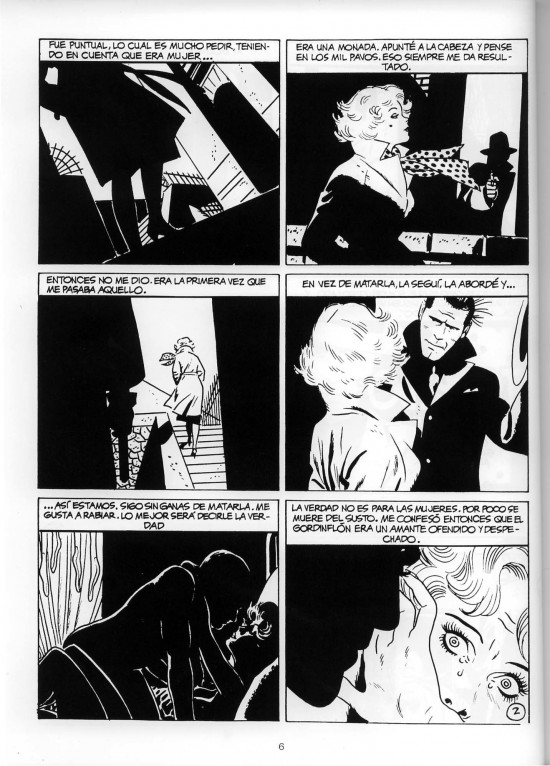
Good Page Layouts: The Classics
Here is an example of a page with a good panel arrangement:

It’s a classic page design: the famous 2×3 grid used by many masters of the craft. Nowadays it might seem a bit old-fashioned and boring, but it still works perfectly.
Some classic master examples:


Good Page Layouts: The Modern & Dynamic
But let’s suppose we are all young and rebellious here (?) and we don’t like that old-fashioned, “unexciting” design—we want something more “modern.” In this next example, notice that the reading flow isn’t interrupted even though a more dynamic layout is used:
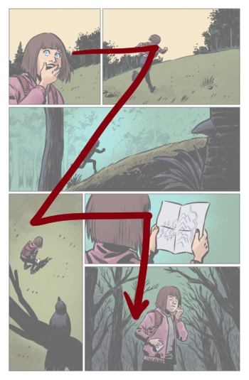
Building on that last design, we can get even crazier with the panel arrangement without it affecting the reading flow:

Examples of dynamic page designs by modern masters Sean Murphy, Mike Mignola, and Eduardo Risso.


Poor Page Layouts: What to Avoid
Now let’s look at some examples where a bad panel arrangement can hinder reading:

In these examples, when the reader gets to panel 2, they’ll hesitate for a few seconds, deciding whether to go to the panel on the right or the one below. This type of page creates confusion, disorients the reader, and breaks the reading flow. The ideal is to have a striking design, but one that is simple enough to be easy to read without interruptions.
Another Flow-Breaker: Dialogue Balloon Order
Another element that can mess with the reading flow is the order of the speech balloons.
Let’s use this great joke 😂 to show how dialogue can interfere with reading:
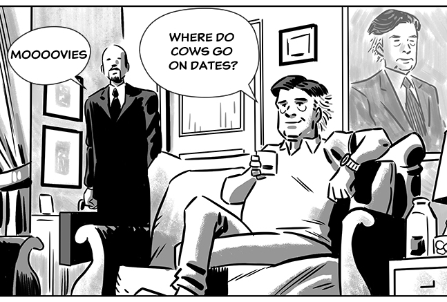
This example is a bit exaggerated, precisely to make the error very obvious. But this panel is inherently a bit complex to letter, since the character who asks the question is on the right, and the one who answers is on the left.
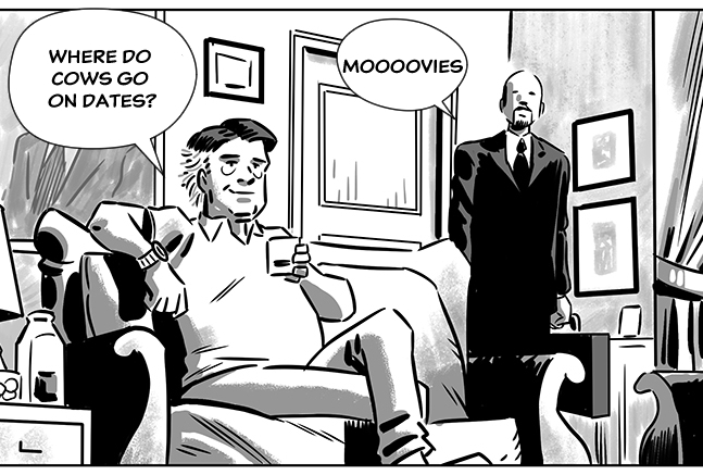
The simplest solution would be to draw it the other way around, so the one who speaks first is on the left side of the panel. But we can’t always do that for various reasons (like not breaking the 180-degree rule, for example).
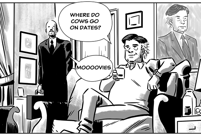
If we can’t redraw the characters in a different position within the panel, we have to think very carefully about where we place the speech balloons to ensure the reading order is correct.