Graphic narrative is a fundamental part of drawing comics. For some artists, it’s the most fundamental part.
In my opinion, a comic artist can get a lot “wrong”—bad anatomy, bad perspective, bad inking, etc., etc.—and still be an effective comic artist if they have good graphic storytelling. On the other hand, if a highly skilled artist tells a story poorly, they might be a great illustrator, but they’ll be a bad comic book creator.
Comics are about telling a story through drawings, not just about drawing pretty pictures.
When I talk about graphic narrative, I do so from the artist’s point of view. I’m leaving the writer aside simply because I’m not one; surely they have their own perspective on graphic narration. But if you ask me, it’s an artist’s duty to know how to narrate, because we are the ones who think in images, while most writers think in words.
A comic writer .
But what is “Narration”?
Basically, it’s carrying a comic forward and making sure the reader understands what’s happening on the page without relying solely on the text. The text will add richness and depth to the comic, but the basic story should be understandable without reading it.
So, if the artist narrates poorly, is the comic incomprehensible?
No, the reader will likely still understand it. An artist has to do a very poor job for the story to be completely lost. But if we want to guide the reader in a friendly way through the story and provide a good experience, we must learn to narrate with our drawings, and thus become true comic storytellers.
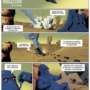
To try and explain it better, here are two examples below.
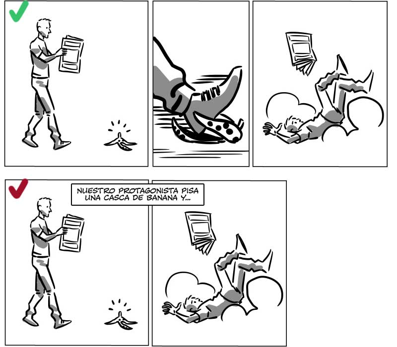
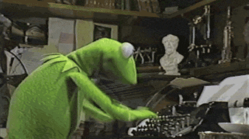
Telling a story well vs. telling it poorly.
The top strip is well-narrated; you understand perfectly what happens without any text. The bottom strip is poorly narrated, or at least, narrated inefficiently. Notice how we have to rely on the text to understand what’s happening. This doesn’t mean text is always unnecessary—it’s only a problem when it’s used to explain the actions that should be clear from the drawings.
No Text: Story is clear.
Text that enriches the comic: Good!
Redundant, boring explanatory text: Bad.
Graphic Narrative: Choosing the Moments
Let’s use this “script” (for lack of a better word :P) for an example:
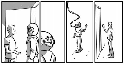
“A man is reading quietly in his house, someone knocks on his door, the man goes to answer it and on the other side he finds a scuba diver.”
The sequence would be something like this:
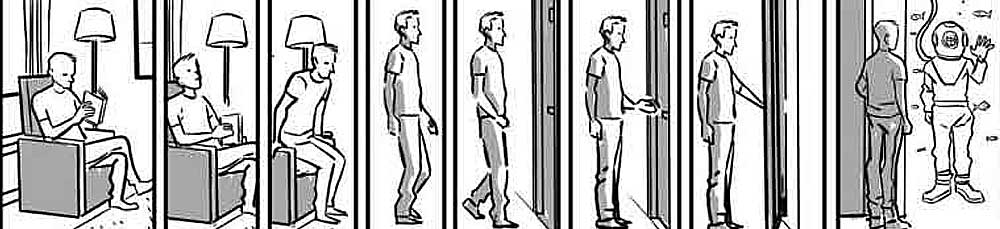
Example 1
But of course, it’s a bit long, with too many “moments.” Following this logic, a very simple story could last for many, many pages.
We don’t have to draw that entire long sequence, we just need to keep it in mind and from it, choose only the “moments” that move the plot forward. Always thinking about the reader, and making sure they understand what’s happening.
So, which are the fundamental “moments” to understand the story? From the 8 panels in Example 1, the most important ones are the first and the last. If we use only those 2 panels, the story is still understood thanks to the power of the temporal ellipsis (jumping in time).
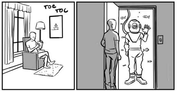
Example 2
In Example 1 the narration is very slow due to the excessive use of panels, and in Example 2 the narration is very fast and not very fluid. In my opinion, Example 2 is missing some “moments”.
My interpretation of the script is the following, more paced than Example 2, but not as much as Example 1.
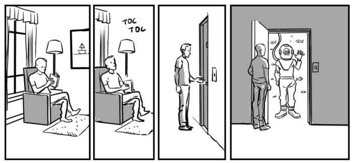
Example 3
Another artist might choose these “Moments”:

Example 4
And that’s not wrong, it just makes the sequence faster; it seems like less “time” has passed due to the lack of a panel. A lower number of panels gives the appearance that time is shorter.
If you give the same script to two different artists, they will each interpret it in their own way. If they are good storytellers, they will both do it well. Neither better nor worse, just different.
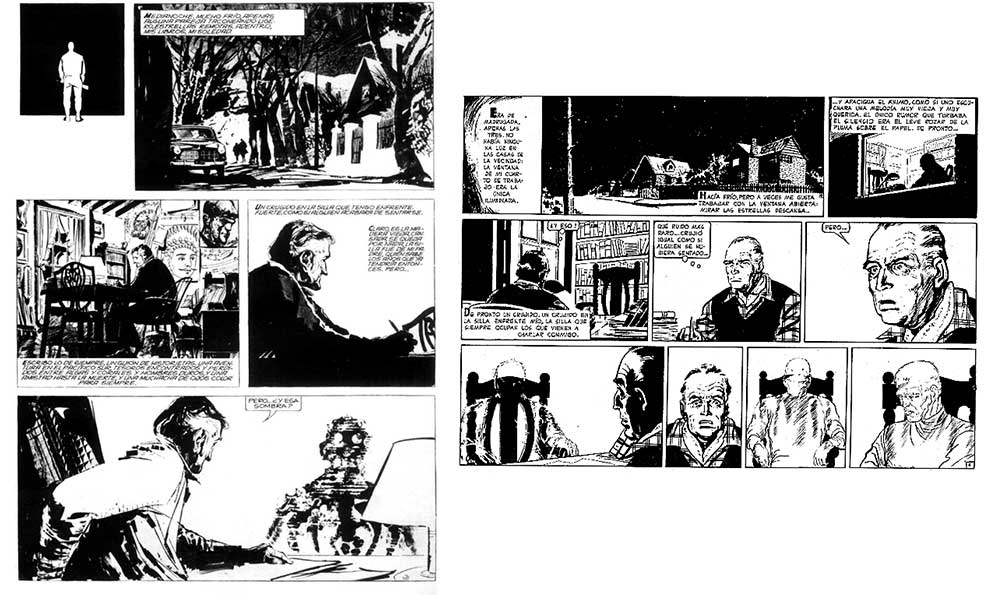
Below we can see the first page of El Eternauta, one drawn by Alberto Breccia and the other by Solano Lopez. Same script, different results.
The Flow of Action
And what about this strip?

Example 5
The strip is well-narrated, the “moments” are adequate, but by moving the character to the left we don’t create a fluid narration and it looks a bit clunky. If the character looks and moves towards the next panel, it guides the reader’s eye and makes the narration much more “friendly”.

Example 6
The Use of Shots
Another fundamental factor for graphic narrative is the use of shots. Shots help guide the reader’s view to important elements in each panel and make stories more immersive.

Example 7: Use of Different Shots
To learn more about the Types of Shots, I recommend you read this Post: [Shots and angles in comics].
The 180-Degree Rule (Crossing the Line)
One of the most repeated mistakes among amateur authors (and not-so-amateur ones) is “crossing the line” or “jumping the axis.” Although this term comes from cinematic language, I haven’t found another name that applies to comics.
This is a topic I find a bit complicated to explain, so let’s go straight to the example:
Example 1: Axis Jump
In Example 1, our characters continue the scene from the previous strip. But let’s analyze each panel:
- Panel 1: The characters are talking.
- Panel 2: Here comes our first problem: Who is the scuba diver looking at? The other character? A third character outside the frame? We don’t know.
- Panel 3: Is the diver entering the house or walking away from it? Again, it’s confusing.
- Panel 4: Is the homeowner inside or outside?

Example 2: Correct Axis
The Example 2 above is the correct way to draw that scene without breaking the 180-degree rule.
- Panel 1: The characters are talking.
- Panel 2: It’s clear who the diver is talking to, even though the character is outside the panel.
- Panel 3: The diver walks away from the house.
- Panel 4: The homeowner remains inside.
When you break the 180-degree rule, you lose visual continuity and the reader loses the spatial location of the characters, creating confusion as they can’t fully understand the actions happening on the page.
The most recommended way to avoid this mistake is to give each character a fixed location on the “stage.” For example, if a character is on the left, they should always appear on that side throughout the different panels.
To get it right, we can trace an imaginary semicircle around the characters and have the “camera” always stay on one side of this semicircle. This is known as the 180-Degree Rule.
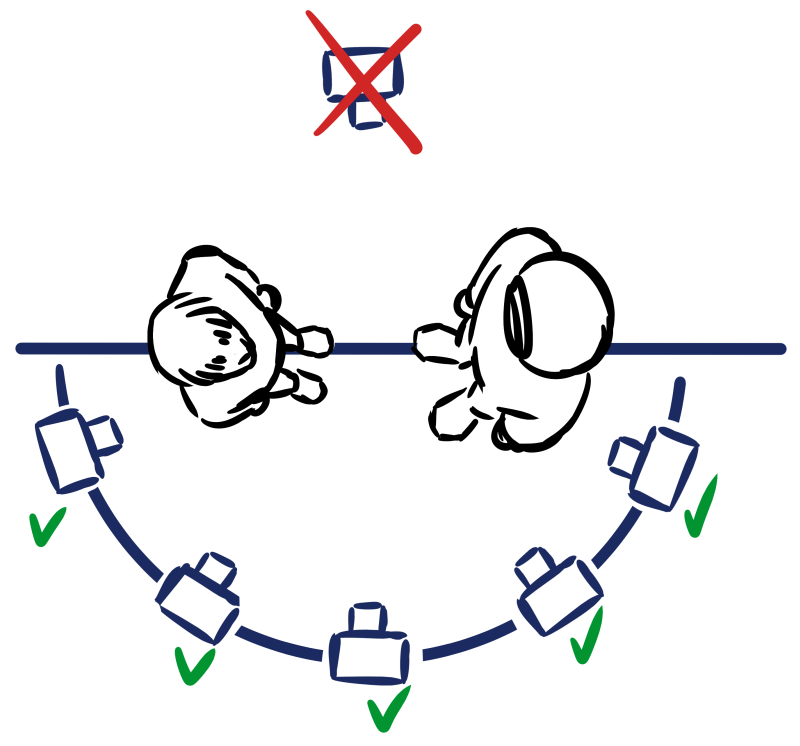
Diagram illustrating the 180-degree rule
These are some of the shots we could get if we use the 180-degree rule:

Example shots following the rule.
Can the 180-degree rule be broken? Rules are made to be broken, and this is no exception. The important thing is that we know it exists and to think very carefully about when we can break it, keeping in mind that it will likely confuse our reader.
Recommended lectures.
Graphic storytelling is a very complex subject; this article is just an introduction. If you want to continue learning how to tell stories with images, I recommend reading and studying these books:


